Thursday, February 25, 2010

Lunada Before & After

Sometimes when Lunada is done with a project, it is so hard to imagine what we started with.  For this Lunada Before & After we will look at what was once the ONLY full bathroom in this house for 3.  Originally, due to the fact that Lunada would be adding 2 bathrooms to this home, the owner felt that they could save some time and money by just leaving it the way it was.  Well after watching the transformation of their home, the owner decided to just go for it and do just a face-lift to the bathroom.  To all of our surprise, the results are NIGHT AND DAY.  All of the plumbing fixtures are original (faucets, shower head, tub spout, tub, sink, etc.) and so are the windows, but everything else is new. The majority of the tiles are ceramic including the white subway tiles which are always a cost effective and clean looking solution. The backsplash is made of glass and marble tiles, a more expensive material but considering the small amount that was needed, it all balanced out in the end. By adding more counter space, cabinets, and 2 other bathrooms, the original clutter was eliminated naturally and the client and Lunada couldn't be happier with the results.

Before


After


For more great designs be sure to check out our website: www.lunadaconsulting.com

Lunada's Favorites

Lunada's new favorite product is a line of glass tiles by Italian company Evit. It seems that there is always a need for new product and this seems to satisfy the glass tile niche by offering these two great variations on bubbles. They can either go ultra modern or playful and fun depending on the color choice and they add a level of dimensionality. Interested in dimensional tiles? Check out Lunada's blog on 3D tiles!


Lunada loves to use glass tiles so check out our website to see some great examples: www.lunadaconsulting.com

Breakfast Nooks

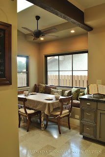
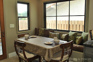
One of the things that Jane always talks about with clients is that they should be honest about the way they live. When people hire designers, they have the opportunity to design their home for the way they live. For example, formal dinners are things that are now done only a couple times a year, and people's formal dining rooms are collecting dust and taking up valuable real estate. Now I am not proposing that homes be built without dining rooms, but instead of families eating around the TV every night breakfast nooks are a great alternative for everyday dining. Located conveniently off of the kitchen you are able to sit across the table from your family as opposed to next to them at island seating or in separate rooms. Moving even further into breakfast nooks, you can add a bench seating that offers hidden storage beneath the cushions or even a window seat. Window seats are great opportunities for increasing your space without affecting the square footage!! You can also add elements like a butlers pantry, skylights, pantry, etc. Casual dining is realistic. And just because you just redesigned your formal dining room doesn't mean you are going to use it more. Don't feel guilty, just realize the potential for other rooms in your home, like your breakfast nook.

Here are 2 great examples of Lunada breakfast nooks:


Be sure to check out Lunada's website to view more projects: www.lunadaconsulting.com

Wednesday, February 24, 2010

Fireplace Facelifts

A major selling point for homes has always been fireplaces. People love them for the cozy atmosphere they add to a chilly winter night but they may not always love the way they look. As the largest architectural feature in your living/family room the dated brick or old fashioned mantle might be hindering you from achieving your design aesthetic. Home owners are usually wary of proclaimed "weekend projects" or "easy fixes" due to the fact that they normally drag on longer than expected and can become an even bigger headache than originally so. Well, have no fear Lunada will show you the way to give your fireplace an quick and easy face-lift that will drastically improve it's look and your entire room's look.

First of all brick is easily painted. Old red brick can be painted any color for a clean and fresh look in about an hour. Today, consumers can easily benefit from pre-fab items such as mantles. You can pick up a new mantle at Home Depot and install it yourself in a weekend for a dramatic new look. Or you can always cover up that old brick with a new stone. You can find a great stone slab at your local stone yard where they can then measure, fabricate (a.k.a. cut and fit) and install it for you. Stone is so beautiful and can be so inspiring. You may think that sounds so lame but I am serious -- throw out your preconceived notions of stone: is not made equal. Don't be scared to ask for help from the pros, they are the pros for a reason. Bring pictures of your room and maybe even some inspiration from the pages of a design magazine. Don't let that ugly fireplace stand in the way of having your dream living room!

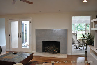
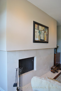
Here are some examples of quick fixes to some Lunada fireplaces.

Before & After:


Before & After


These are more contemporary solutions, but add a wood mantle and you have a completely different look. And don't forget to take some notes from our Color Series of blogs, mantles don't always have to be white!

Be sure to check out more Lunada projects on our website: www.lunadaconsulting.com

Monday, February 22, 2010

Lunada's Favorites

Ikea. Ikea, Ikea, Ikea. You have reached the masses with your flat packed, allen wrench required "Swedish" furniture and basically the only reason why college students don't live in total squalor anymore. Over the past few years you have managed to refine your designs and improve your quality thus allowing real adults to not feel so guilty when they purchase your products. And now you've really done it...........you are now offering solar lighting. Ta da!! SOLIG: the new line of solar lighting offered by Ikea includes outdoor lighting with a few table lamps that would probably work if placed next to a sunny windows. Although they are only offered in 4 colors: red, blue, white and black, and the designs are nothing special, they are affordable (gasp!). So, thanks Ikea, I appreciate what you are doing and keep offering those delicious $1 ice cream cones that always seem to get me on the way out.


Thursday, February 11, 2010

Color Series: Trends

As with all things that deal with artistic expression, interior design seems to run parallel with other disciplines when it comes to trends. One of the most obvious and influential is fashion design. Like fashion, interior design deals with fabrics, colors, textures, and patterns so it seems natural that the two would go hand in hand.

Every decade can be identified by it's trend and when something can't be defined originally, it becomes defined as "a take on something", a revival, __nouveau, or -ish. Well, COLOR has come back in a big way and I believe that it has been influenced by revival of design cues in our wardrobe. Did you really ever think that hammer pants or dayglow Raybans would come back in style? Neither did I, but here I stand corrected. People are going all out with bold patterns and graphics, colors, textures, you name it and it has now spread to interiors. In the late 90s blue was the new black, then it was purple, then green, and here we actually find ourselves at my favorite color.....yellow. Yellow is everywhere if you open your eyes. Fashion is currently favoring mustard, interiors: canary. I for one couldn't be more thrilled, but to each their own.

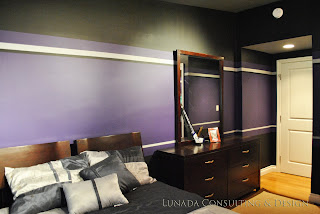
So the point of this blog is to say, when looking for inspiration for your home or remodel don't be afraid to let yourself be influenced by other disciplines. Design your living room around your favorite sculpture or piece of art. Something that Lunada did very recently was abstract an L.A. King's jersey onto the walls of a client's bedroom who is a huge fan.


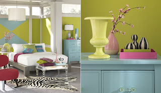
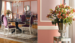
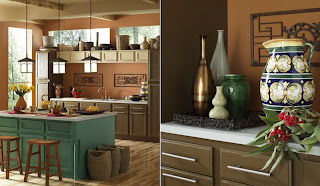
So get out there and splash some color on. It will do you some good. The right color can add sophistication or a touch of whimsy to any space. To get you started here are some colorful examples where you can start thanks to sherwinwilliams.com


Color Series: Color 101

Color Theory 101, I had to take it my first year of design school. Granted it was a fun and easy class filled with craft projects that resembled the one's you made for mom and dad when you were 4. But hidden underneath the craft projects was a philosophy/psychology class that begged you to ask "How RED is this red?".
Before I get ahead of myself, let's start by talking about the color wheel.

Comprised of 12 colors that can be broken down in a number of ways, but we will just stick to the 3 most common.


Primary Colors: yellow, red and blue. You remember them, right?


Secondary Colors: orange, purple and green; colors created by mixing a PRIMARY with it's PRIMARY neighbor. (yellow+red=orange, red+blue=purple, blue+yellow=green)


Tertiary Colors: colors created by mixing the PRIMARY and SECONDARY. (yellow+orange=yellow-orange, red+orange+=red-orange. The marriages go on and on to create red-violet, blue-violet, blue-green, yellow-green.)

The End.......j/k


Now that we have refreshed ourselves on the basic color wheel, let's see what we can come up with when we get a little creative.


Monochromatic: use of 1 color that varies from light to dark or in other words saturation.
(Brown/Taupe)

Here is an example of how color wheels represent saturation.


Complimentary: use of 2 colors on opposite ends of the color wheel.
(Red & Green/Pink & Lime)

Triadic: use of 3 colors that create a triangle on the color wheel.
(Red, yellow, blue)


Analogous: use of 3 or more colors next to each other on the color wheel.
(Green tones)
(I know the graphic only shows 2 colors but 3 always looks better).


Class dismissed!

Color Series: Where To Start.

Lunada has had some requests to have a blog about color schemes, paint trends, and strategies for selecting the right colors. Well Lunada thought this was a great idea and we would love to share with you some of our ideas in our Color Series.


First of all, COLOR IS ESSENTIAL to any space. Psychologically, color can create and affect your mood; feelings of serenity, energy, or comfort can be achieved through color. For example, have you ever noticed how many fast food chains use the colors yellow or red in their logo or decor? That is because psychologically red and yellow allow us to feel hungry! Have you ever wondered why people associate white walls/surfaces with hospitals? Most assume that if something is white, it is clean and sterile (that is also why black toilets are rare, besides looking so weird!).


OK so let's get down to it. Have you found yourself standing in Home Depot staring at all the paint swatches and feeling overwhelmed? You might think to yourself, "what colors do I like? Will they go with my furniture? How many colors do I choose for just one room? How much should I buy? What is primer?" Let me take you through it. Let's start with the concept of 3 colors per room: wall, trim & ceiling.


WALL COLOR

Step 1
Think about how you want to feel in your space i.e. energized, relaxed, etc.
---Cooler colors like blues and greens are soothing colors. Warm colors like reds and yellows can be energizing. Neutral/Earth tones can be inviting and warm.


Step 2
Consider the size & time you spend in that particular room. Is it a small bathroom or large living room? How do you feel about your ceilings, do you think they are low or high? Do you spend most of your day there, or only when entertaining?
---Lighter colors of the walls and ceiling help keep the room open and feel larger.
---Highly saturated or bright colors might become bothersome in rooms where you spend a lot of time.

Step 3
Consider what types of hard surfaces you have in the room, pillows and lampshades are easy to replace, your wood furniture and stone floors are another story. ---Be sure to bring home swatches and hold them up to your floors and furniture to see how they look.

Step 4
Take into account the type of lighting you will have hitting those colors! You will probably see a light box with 3 types of lights in them near the paint section. These are useless, so take your swatches home and see how the colors change depending on the light. Incandescent bulbs adds yellow making colors look warmer, fluorescent adds blue making colors cooler, and natural light bleaches colors slightly.

TRIM
-This can include base molding, crown molding, door trim, chair rails, etc.
-Start in the same family of colors as your wall color starting and select one of the lighter or darker versions.
-OR depending on the style of your room, go to the whites and choose a white that matches in tone with your wall color. (Tones: warm, cool or neutral)

CEILING

-Always the lightest color.

-An easy option for selecting a ceiling color is to use your trim color if it is light enough.


Websites like
benjaminmoore.com, sherwinwilliams.com and others usually have color preview programs that visualize the colors on walls and ceilings to help you make your choices. Search the web and flip through magazines to get ideas. And just remember, you can always paint over paint.

Get some color ideas from past Lunada projects: www.lunadaconsulting.com